Northwind Coffee brand kit
Northwind Coffee brand kit
For anyone making things for Northwind Coffee: designers, writers, photographers and printers.
The feel
Calm. Warm. Unfussy.
Specialty beans for people who brew at home on weekends: a good, calm cup without the usual fuss.
Colours
| Colour | Hex | Job |
|---|---|---|
| Filter Paper | #FAF7F2 | Main page background, and label text on buttons |
| Grounds | #2B231D | Body text and headings |
| Roast Brown | #7B5135 | Buttons and links only |
| Oat Linen | #E8DFD0 | Section and card backgrounds, footer |
| Pale Sage | #E3E8DC | Callouts, tips and highlighted panels |
| Kitchen Sage | #8C977D | Decorative accents only: dividers, small illustrations, background shapes |
Approved text pairings. All pass WCAG AA for body text (4.5:1) and large text (3:1). Any pairing not listed here is not approved.
| Text | On | Contrast |
|---|---|---|
| Grounds | Filter Paper | 14.4:1 |
| Grounds | Pale Sage | 12.4:1 |
| Grounds | Oat Linen | 11.7:1 |
| Roast Brown | Filter Paper | 6.4:1 |
| Filter Paper | Roast Brown | 6.4:1 |
| Roast Brown | Pale Sage | 5.5:1 |
| Roast Brown | Oat Linen | 5.2:1 |
Kitchen Sage is never used for text or for icons that carry meaning (2.9:1 on Filter Paper).
How much of each: about 60% Filter Paper, 25% Oat Linen and Pale Sage together, 10% Grounds (mostly text), and 5% Roast Brown and Kitchen Sage combined, with Roast Brown kept for things people can click.
Type
Both fonts are free from Google Fonts. Load only Fraunces 500 and Figtree 400 and 600.
| Use | Font | Weight | Size | Line height |
|---|---|---|---|---|
| Headings (H1) | Fraunces | 500 | 40px (32px on phones) | 1.15 |
| Subheadings (H2, H3) | Fraunces | 500 | 24px | 1.3 |
| Body | Figtree | 400, with 600 for bold | 18px | 1.6 |
| Small print | Figtree | 400 | 14px | 1.5 |
Voice
- Take your time. Write short, unhurried sentences and never push people to act fast.
- Talk to one person, like a neighbour. Use "you" and "we", as if talking across a kitchen counter.
- Say it plainly. Use everyday words, one idea per sentence and no coffee jargon.
- Never make anyone feel they're brewing it wrong. Every method counts.
- Let the coffee do the shouting. No hype, no capitals for emphasis and no exclamation marks.
Words we use: brew, weekend, kitchen, slow, good
Words we never use: artisanal, curated, elevate, hack, connoisseur
Image style
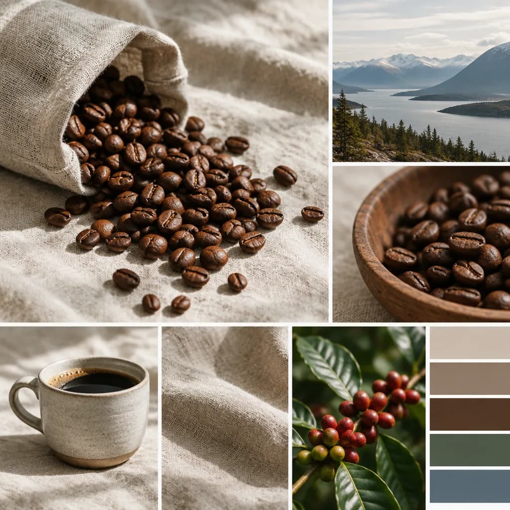
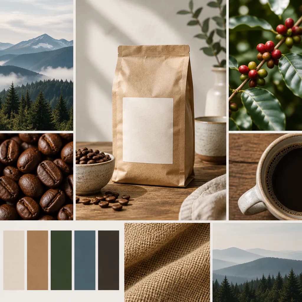
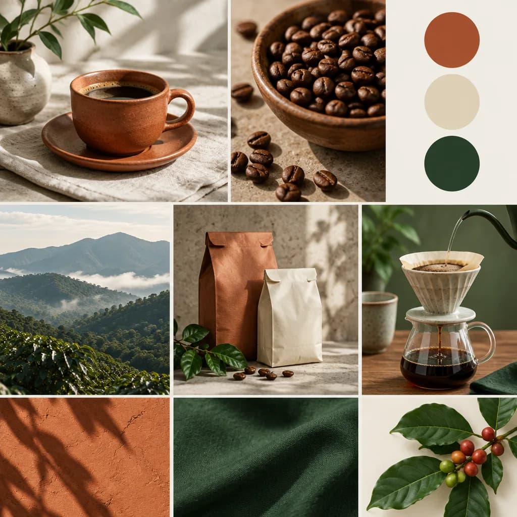
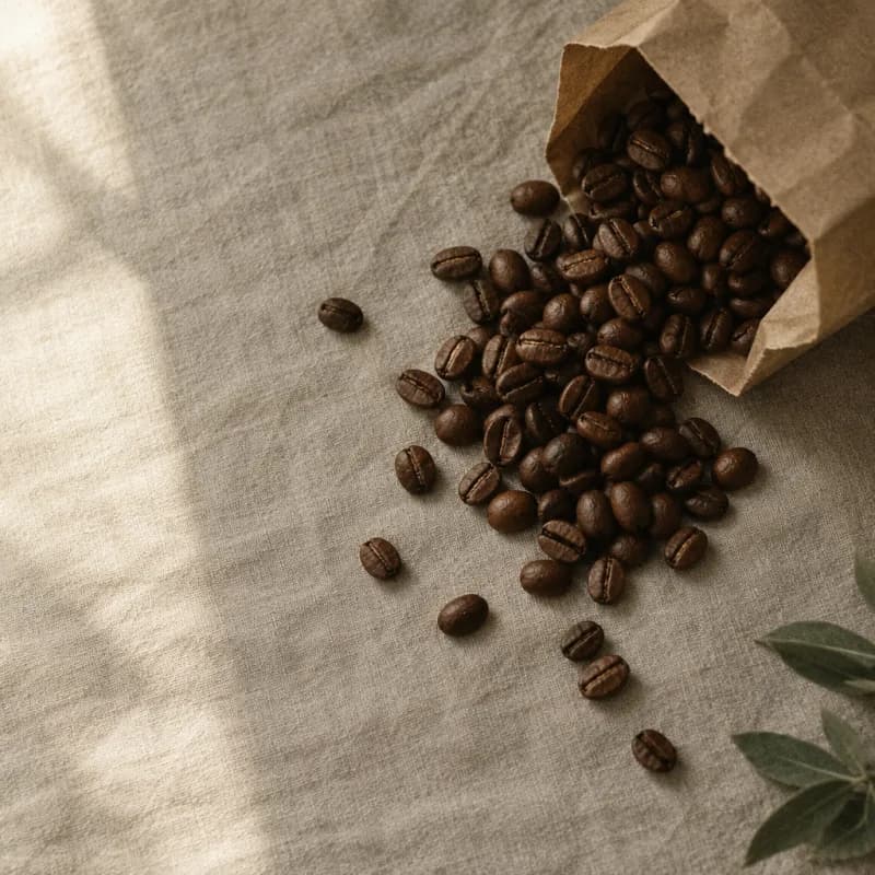
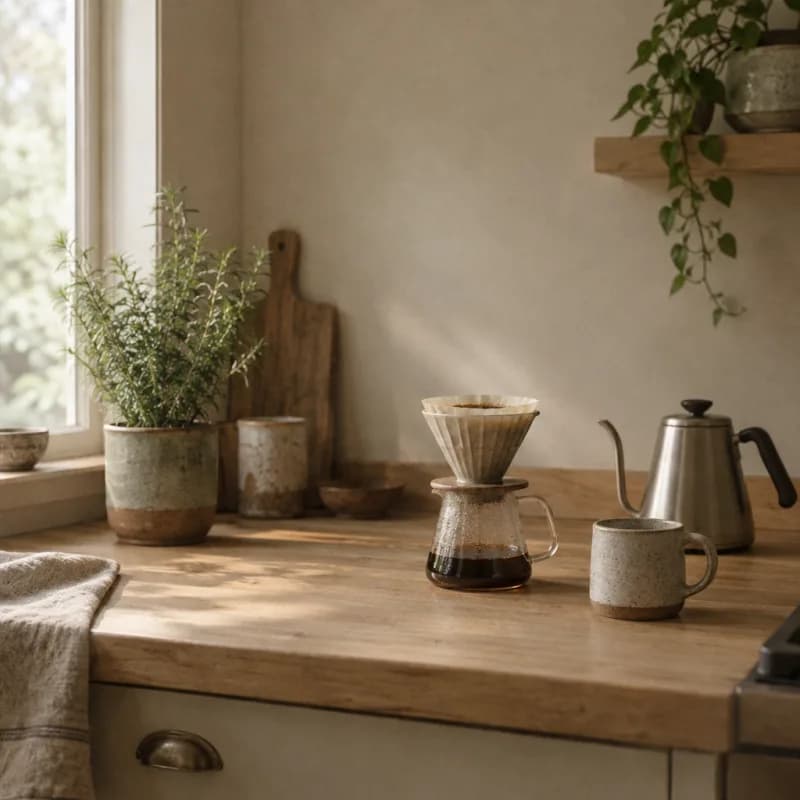
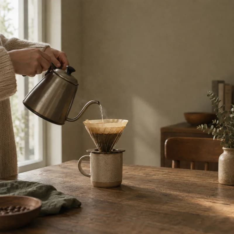
- Light: Soft morning window light from one side, with gentle shadows and low contrast.
- Colour: Muted warm tones of oat, roast brown and sage, like a film photograph with fine grain.
- Subjects: Beans, simple brewing kit and home kitchens that look a little lived in, with people shown only as hands.
- Framing: Top down or eye level, subject off centre, plenty of empty space and no more than three objects in frame.
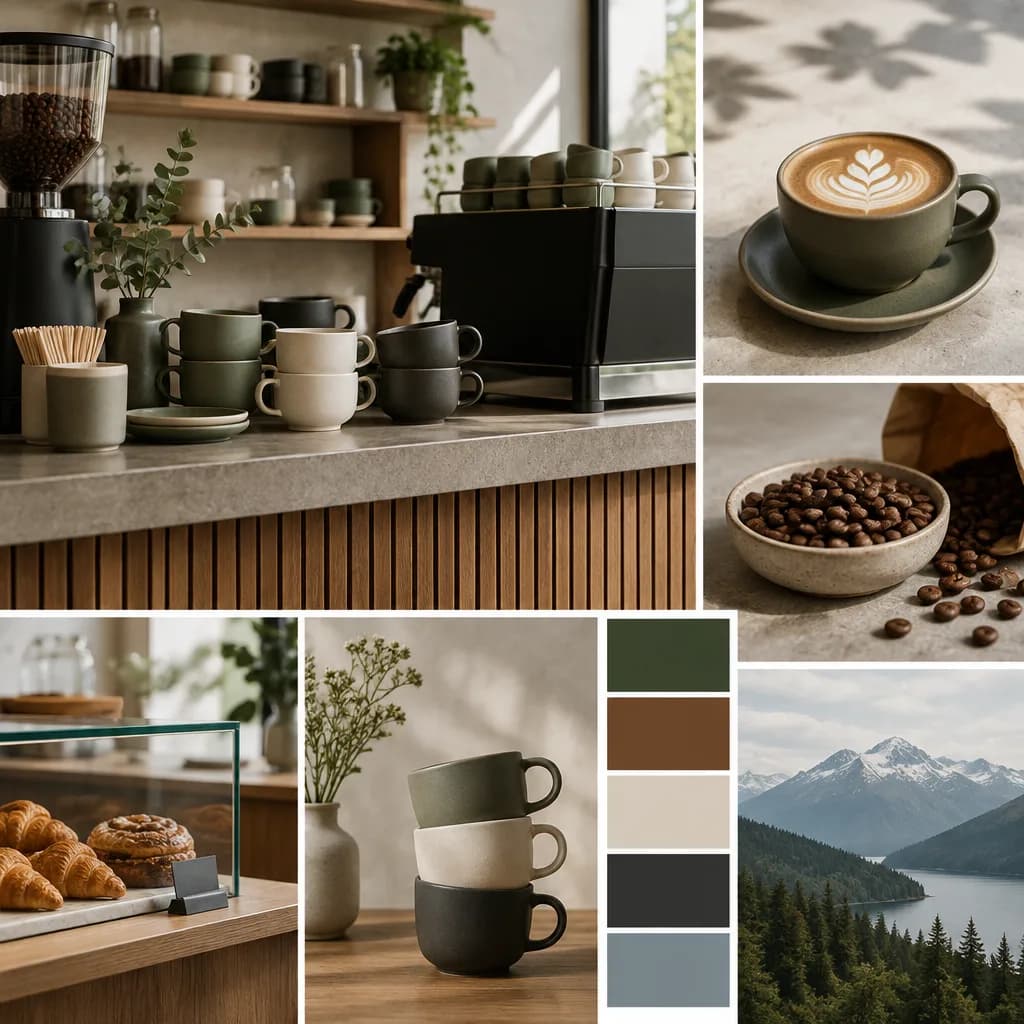
- Avoid: Latte art, dramatic steam, dark moody espresso shots, gloss, busy cafés, cold blue tones and anything that looks staged.
Logo
Until there's a designed logo, use a simple wordmark.
- Wordmark: "Northwind Coffee" on one line, in title case
- Font and weight: Fraunces 500
- Letter spacing: slightly open, +0.02em
- Colour: Grounds
#2B231Don light backgrounds, or Filter Paper#FAF7F2on Roast Brown - Don't: set it in Kitchen Sage, stretch it, outline it or add shadows or other effects


 Claude
 ChatGPT
 Gemini
 Cursor